RNA-seq: Overview of DESeq2 method
Author: Thomas Baardemans, Supervisor: Marc Teunis (Hogeschool Utrecht)
29-Oct-2020
#Installing packages and loading libraries.

# If bioconductor is not installed it can be installed by running the next line of code:
if (!requireNamespace("BiocManager", quietly = TRUE))
    install.packages("BiocManager")
BiocManager::install(version = "3.11")

#Uncomment the following lines of code and run them to install the packages if they are not already installed.
#BiocManager::install("airway")
#BiocManager::install("DESeq2")
#BiocManager::install("biomaRt")
#BiocManager::install("apeglm")
#BiocManager::install("airway")
#install.packages("vcd")
#install.packages("ade4")


#Load the packages
library(tidyverse)
library(DESeq2)
library(dplyr)
library(SummarizedExperiment)
library(airway)
library(here)
library(biomaRt)
library(gridExtra)
library(vcd)
library(ade4)
library(factoextra)
library(airway)
1 Introduction
RNA sequencing is currently the most widely used technique for quantifying gene expression (transcriptome) in tissues, cell cultures or even individual cells. Interpretation of the resulting data is not as straightforward as it might seem due to biases introduced by the methods used and biological variety between samples. In order to correctly analyse a transcriptome dataset it is important to understand methods used to obtain and analyze the data. This lesson aims to give the student a broad overview of a typical RNA-seq experiment. Furthermore it will also give an insight into the statistical tests used by the DESeq2 package (Love, Huber, Anders. 20141) to test for differentially expressed genes. We will use the “airway” dataset that can be installed using bioconductor so the student can follow along using the code provided in the codeblocks.
2 Next Generation Sequencing and mapping reads
Before we can begin to understand any of the statistical tests used by DESeq2 we need to have a rough understanding of the experiment that produced the data and steps involved. RNA-seq experiments use Next Generation sequencers to quantify RNA molecules in cells or tissues. Each step in the experiment influences the data obtained in a different way so we will discuss the main steps seperately.
2.1 Experimental design
Cell/Bacteria cultures can be harvested or biopts can be taken from animals or patients. The minimal design has at least 1 experimental variable and 3 replications (samples) per group. Careful consideration of replication number is advised though since a study using 42 replications per group has shown that using just 3 replications only identifies 20-40% of differentially expressed genes depending on the tool used (Schurch, Nicholas J et al. 20162). To identify >85% of genes regardless of fold change 20 replications are required (fold change is a quantative measure of difference). They conclude at least 6-12 replications are recommended. Because scientists often want to maximize the amount of experimental conditions most of the datasets contain 3 replications.
2.2 Library preparation
After the RNA is extracted from the sample the ribosomal RNA (rRNA) needs to be removed. Over 90% of the RNA found in a cell is rRNA and only 1-2 % of the RNA is the mRNA we are interested in in a standard RNA-seq experiment (Conesa et al. 20163). mRNA selection can be achieved by selecting for the poly(A) tail found on eukaryotic mRNA’s or by depleting rRNA. poly(A) selection yields better results but is not always possible in biopts and is never possible in bacteria because they do not have poly(A) tails in their mRNA’s. poly(A) selection also filters out other non coding DNA such as microRNAs (miRNAs) because they do not contain a poly A tail either. After selection the mRNA’s are fragmented and reverse transcripted to synthesize the cDNA library. The fragmentation is necessary because most Next Generation Sequencing machines can only sequence molecules up to 300 basepairs.

Figure 1: Steps involved in cDNA library synthesis for a standard RNA-seq experiment.
2.3 Next Generation Sequencing (NGS) and read depth
After cDNA synthesis the fragments are ligated to adapters to attach the molecules to the nanowells in a flowcell. NGS uses 1 strand of the cDNA to synthesize the complementing strand using fluorescently labelled nucleotides. After each cycle a new nucleotide is attached and the flowcell is imaged in order to call the base.
Read depth (also know as sequencing depth) is a parameter with a different meaning depending on the experiment conducted. If a whole genome is sequenced the read depth is the number of times each nucleotide has been sequenced to call the base. In a typical whole genome experiment an average read depth of 30 to 50x is recommended by illumina. When using RNA-seq the read depth takes on a different meaning: It is the amount of reads that is “sampled” from the whole population of cDNA molecules in the library (tarazona et al. 20114). This usually runs in the millions depending on the goal of the experiment and can be > 100 million reads per sample. More read depth results in a more accurate quantification of genes that are expressed in low amounts.
Further reading: The complete method of NGS is beyond the scope of this lesson. For a more in-depth understanding of the NGS method you can watch this video: https://www.ibiology.org/techniques/next-generation-sequencing/#part-1 (short read NGS starts at 06:46 and ends at 20:52).
2.4 Mapping reads
Now that the sequences of the reads are known they need to be mapped to a reference genome and counted (each cDNA fragment that is sequenced is usually reffered to as a “read” or a “count”). Usually the raw sequences of the reads are submitted to the Short Read Archive (SRA) so other researchers can reproduce this step and every step hereafter. Mapping the reads to the genome proves to be harder than might be expected at first. One of the challenges is presented by the different isoforms of genes produced by alternative splicing. Over 90% of human genes are alternatively spliced producing a big amount of possible isoforms (Stark, Grzelak, Hadfield. 20195). This leads to reads being mapped ambiguously (fitting on more than one isoform) making it hard to count which read belongs to which isoform.
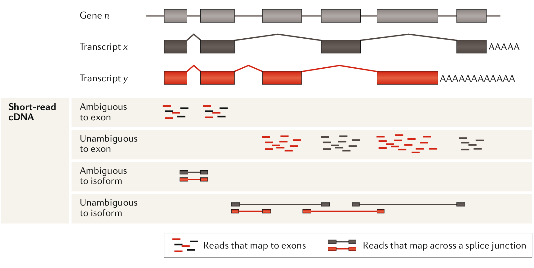
Figure 2: Ambiguous reads present a problem in assigning a read to specific isoform. Even splice junction spanning reads can be ambiguous. Using the unambiguous reads an estimate can be made about isoform prevalence. Adapted from Stark, Grzelak, Hadfield. 2019
Paralogues reads prove to be an even harder problem to solve. Paralogues genes are genes that share a (relatively recent) common ancestor gene. This can lead to large portions of the sequence being completely identical. If a read falls within this zone it is impossible to know whether it belongs to gene x or y. Simply discarding these “multireads” can result in an underrepresentation of counts from genes that have lots of paralogues like the ubiquitin family for example. Some software (ERANGE) distributes these multireads in proportion to the number of unique and splice reads at similar loci (Mortazavi 20086)
Further reading: To understand the algorithm used to map reads to the genome while making efficient use of computing resources (Burrows-Wheeler transform) watch this lecture by MIT professor David Gifford: https://www.youtube.com/watch?v=P3ORBMon8aw
After assigning each read to a gene all the readcounts are stored in an expression matrix file (Also referred to as counts data or assay data). This expression matrix is sometimes also included in the expressionset uploaded to GEO but more often than not it is a seperate file included in the supplementary files. In other lessons of the course you will learn how to organize this expressionset into a neat dataset ready to be analyzed. For this lesson we will use a dataset called “airway” that can be downloaded/installed using bioconductor.
#load the dataset:
data(airway)

#There should now be an "airway" object loaded into your global environment.
The airway dataset has already been cleaned up and formed into a SummarizedExperiment ready for a differential expression analysis. Before we start analyzing it is important to first explore the dataset to see what we are actually working with.
Exercise 1: Inspect the airway dataset using the metadata(), assay() and colData() functions from the SummarizedExperiment package. Use these functions to answer the following questions:
- What kind of cells have been used in the experiment?
- How does the assaydata relate to the coldata?
- What are the experimental conditions?
open the codeblock to reveal the answers.
# Answer 1: airway smooth muscle cells (use metadata() function to see title and link to pubmed).

# Answer 2: The columnnames of the assaydata are linked to rownames of the colData. So each row in the colData contains information about a sample (column in assaydata).

# Answer 3: Dex and cell. Read the pubmed abstract to get more info about dex. Because this dataset is only a subset of a bigger dataset there is also a variable called albut. All the samples untreated so its not an experimental group in our subset of the data.
3 Differential gene expression analysis
Now we have our dataset loaded we can start to look for differences in expression between samples. However before we can run statistical test on the data there are a few steps to go through. These steps are included in the DESeq2 function. DESeq2 is basically a “wrapper” function that executes a number of other functions in the “background”. The purpose of these functions is roughly the following:
- Estimation of size factor
- Estimation of dispersion
- Testing
In this chapter we will go through each step in but before we get there we will dive into the binomial and Poisson distributions distributions first.
3.1 Binomial distribution
A binomial distribution works with boolean values: true/false, 0 or 1, fail or succes. The simplest example of a binomial distribution is the coin toss. Each “cointoss” is called a Bernoulli trial.
exercise: Use rbinom to simulate 100 double die rolls. Where throwing 6 is considered “succes” and everything below a “fail”. The results should show a “1” when a single 6 has been rolled and “2” when both die rolled a 6.
#Answer:
rbinom(100, 2, prob = 1/6)
##   [1] 1 0 0 0 0 0 1 0 0 1 0 0 0 0 1 0 0 1 0 0 0 0 0 0 1 0 0 0 0 0 0 0 1 0 1 1 0
##  [38] 1 2 1 0 0 1 0 1 0 0 0 1 1 0 0 1 1 0 0 0 2 0 0 0 0 0 1 0 1 0 0 0 1 0 0 0 0
##  [75] 0 0 0 1 0 1 0 1 0 1 0 0 0 0 0 1 1 0 0 0 0 0 0 1 1 2
To get complete distribution of probabilities we use dbinom. note: use rbinom to generate data (r stands for random in this case). use dbinom to generate a probability. This also works with other statistical distributions as we will see later on in the lesson.
#probability that 6 is thrown twice.
dbinom(2, 2, prob = 1/6)
## [1] 0.02777778

#to get the probabilities for all possible outcomes we use the colon. the chance of 3 succes if ofcourse zero because we only throw with 2 dice.
dbinom(0:3, 2, prob = 1/6)
## [1] 0.69444444 0.27777778 0.02777778 0.00000000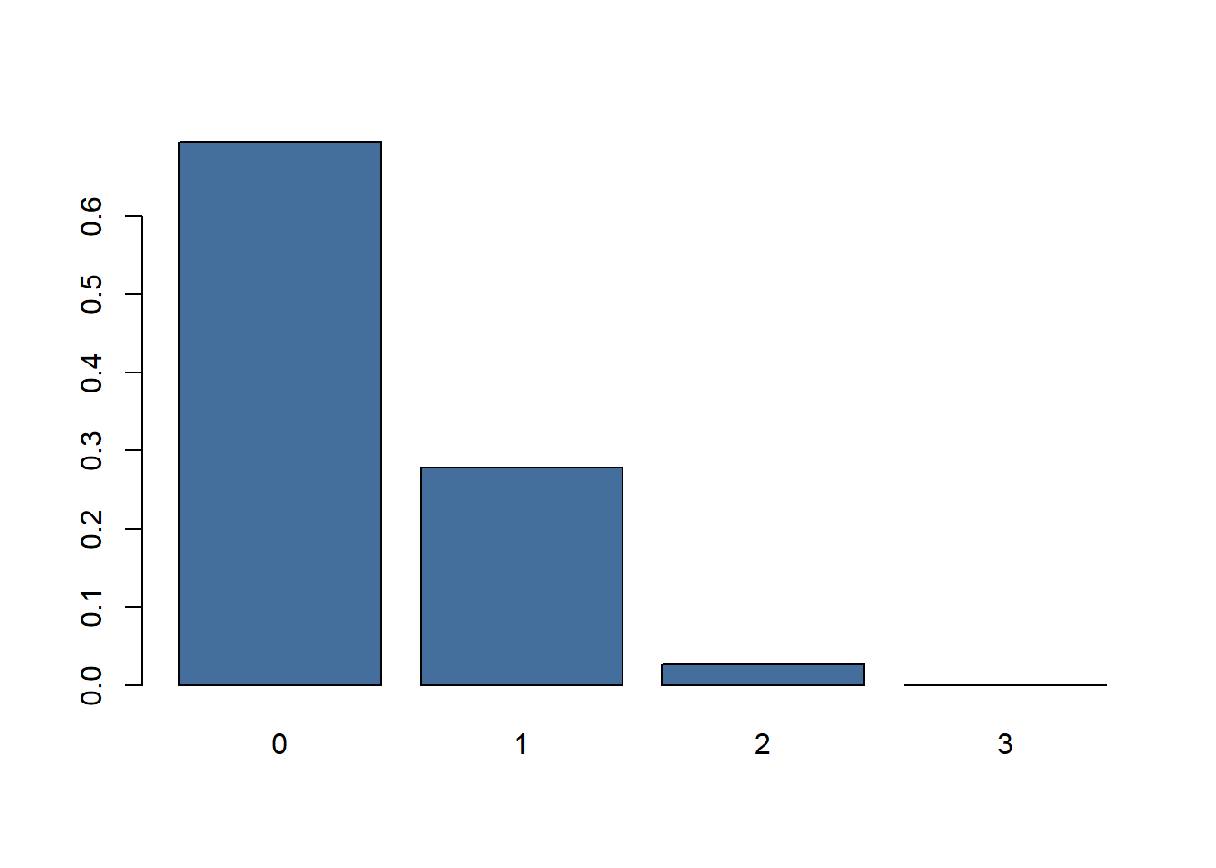
Figure 3: Barplot of probabilities throwing 0,1 or 2 sixes.
3.2 Poisson distribution
When the probability of success p is small and the number of trials n large, the binomial distribution can be faithfully approximated by a simpler distribution, the Poisson distribution with rate parameter λ=np. (Recited from: Modern Statistics for Modern Biology7)
barplot(dpois(x = 0:12, lambda = 6), names.arg = 0:12, col = "#446e9b" , xlab = "k", ylab = "P(X=k)")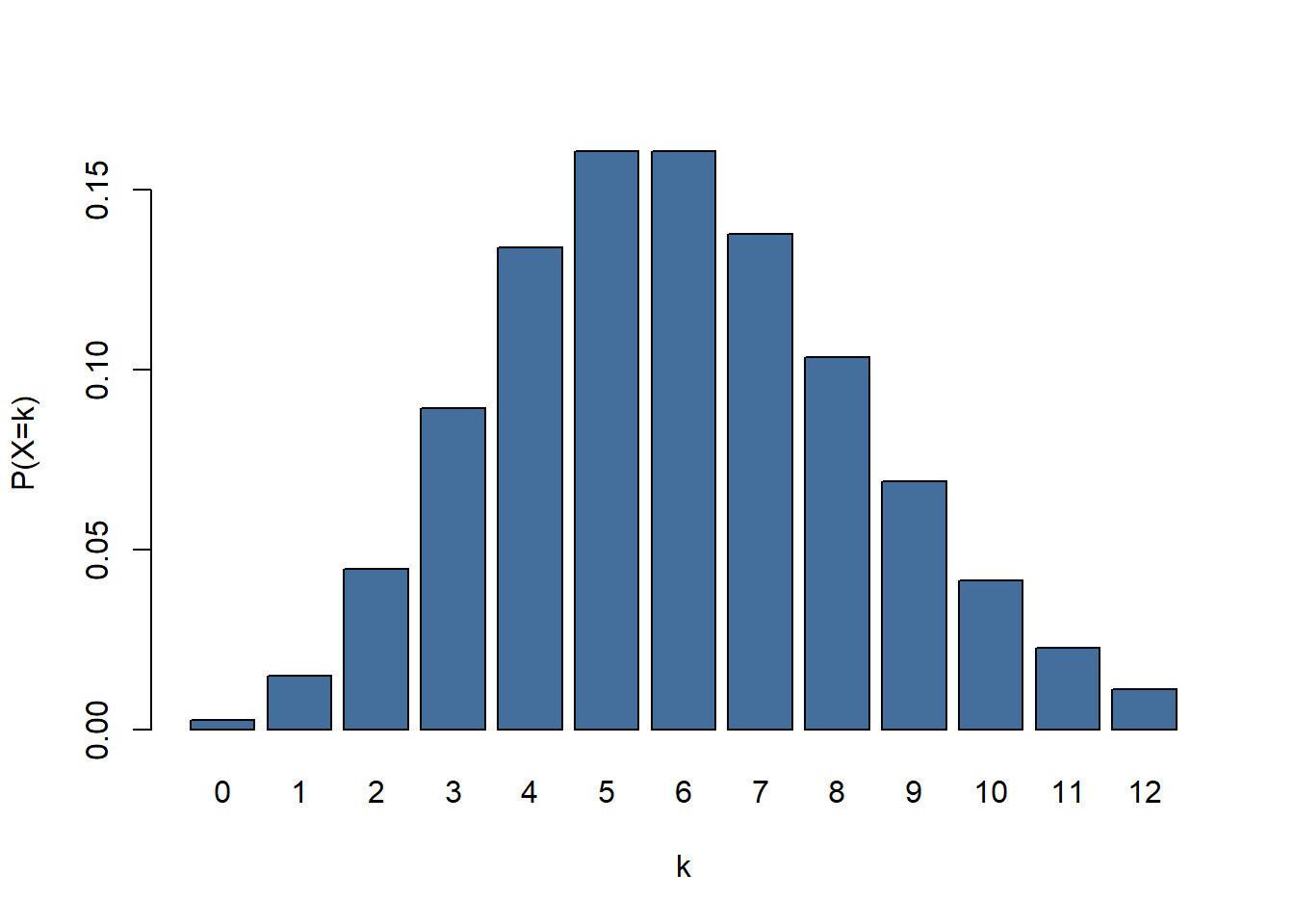
figure 4: A barplot showing a Poisson distribution. k = number of occurences, P(X=k) = probability of succes given lambda
If we look at figure 4 there is an event with a \(\lambda\) of 6. \(\lambda\) might represent the number of letters someone has received on average each day for the last month. If we were to look at the mail that arrived on a given day there is a chance of 0.04 (P) of us counting 2 (\(\kappa\)) pieces of mail.
3.3 Example: DNA mutation rate
A good example of a Poisson distribution is the mutation rate of DNA. If we want to know the amount of mutations we can we are likely to find in 1 kb of DNA we start with determining the \(\lambda\) (event rate / Poisson mean). In this hypothetical example we examine 1 mb and find 307 mutations. So \(\lambda\) = 312/1000 = 0.307. To calculate the probability we find 3 mutation in 1 kb of DNA we can use the following Poisson formula. Note that P(X=k) is the probability of observing \(\kappa\).
So in this formula we input \(\lambda\) = 0.307, \(\kappa\) = 3. Note that the ! represents a factorial: n! = n * (n-1) * (n-2) … So our k! = 321 = 6. In R we can use this formula as follows:
0.312^3 * exp(-0.307) / factorial(3)
## [1] 0.003723781

# However there is a function in R that will work equally well:

dpois(x = 3, lambda = 0.307)
## [1] 0.003547607
so there is a probability 0.0035 that a given kb contains 3 mutations. So we expect to find about 4 sections of DNA to contain 3 mutations. To get P(X=k) for all the other\(\kappa\) values we can change the code slightly:
mutationprobability <- dpois(x = 0:4, lambda = 0.307)
mutationprobability
## [1] 0.7356506009 0.2258447345 0.0346671667 0.0035476067 0.0002722788

# To get the probability that there are 5 or more mutations in a kb we can simply subtract the sum of probabilities 0:4 from the number 1. We will need this later to perform a chi-squared test.
mutationprobability <- c(mutationprobability, 1-sum(mutationprobability))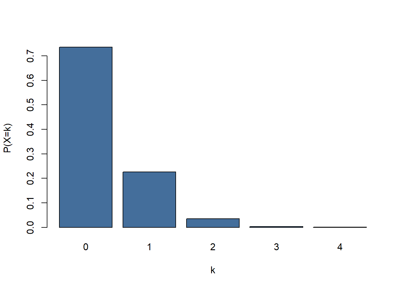
Figure 5: Distribution of mutations/kb for lambda = 0.307
Now we know the distribution that we would expect if the DNA mutationrate follows a Poisson distribution (figure 5) we can compare it against our observed data. After fragmenting our hypothetical sample DNA into 1kb pieces and sequencing them we get the following results:
| mutations | expected number of fragments | observed number of fragments |
|---|---|---|
| 0 | 735.651 | 740 |
| 1 | 225.845 | 218 |
| 2 | 34.667 | 37 |
| 3 | 3.548 | 5 |
| 4 | 0.272 | 0 |
| 5+ | 0.018 | 0 |
The results look fairly close to the expected results if the mutationrate of DNA follows a Poisson distribution. We can test this using a chi-squared test. The chi-squared test determines whether there is a statistically significant difference between expected frequencies and observed frequencies.
H0: Observed frequencies follow expected frequencies, the mutationrate of DNA follows a Poisson distrubution.
H1: Observed frequencies do not follow expected frequencies, the mutationrate of DNA does not follow a Poisson distribution
chisq.test(x = mutationresults, p = mutationprobability)
##
##  Chi-squared test for given probabilities
##
## data:  mutationresults
## X-squared = 1.3396864, df = 5, p-value = 0.9307955
the p-value > 0.05 so we accept H0.
3.4 Exercise: V1 flying bomb. Guided weapon or a case of Poisson distribution?

Figure 6: Illustration of a V1 flying bomb. The V stands for ‘vergeltungswaffen’ (vengeance weapon) and was used to terrorize London civilians in the second world war.
Poisson distributions occur in all kinds of unexpected places. During World War 2 the German army developed a flying bomb (V1 and later V2) to terrorize civilians in London. The impact sites of these bombs tended to be grouped in clusters. This made the English wonder whether these clusters were the result of some aiming mechanism on the bombs or if it was just chance. Statistician R. D. Clarke set out to tackle this problem (Clarke 19468). He selected a 144 km2area on the map of south London and divided it in 576 squares of 0,25 km2. Counting the recorded impacts over the last x months Clarke determined there had been 537 impacts of flying bombs in the selected area.
Exercise 2: Use the information given above to calculate the probabilities that a given square had 0,1,2,3,4 or 5+ impacts if the impacts were distributed according Poisson probability.
Open the codeblock to reveal the answer.
#First we calculate the chance that a given square got bombed 0,1,2,3 or 4 times.
zero_to_four <- dpois(x = 0:4, lambda = 537/576)

#The chance a square gets impacted 5 or more times is 1 minus the sum of chances it gets hit 0 to 4 times.
five_plus <- 1-sum(zero_to_four)

#Concatenating the chances.
poissonexpectation <- c(zero_to_four, five_plus)

#Show the complete vector of probabilities (from 0 to 5+):
poissonexpectation
## [1] 0.393650560040 0.366997136704 0.171074186120 0.053163679367 0.012391013811
## [6] 0.002723423957
Next Clarke counted the number of squares that contained 0,1,2,3,4 and 5+ bomb impacts. Clarke hypothesized that if the V1 flying bombs contained an aiming mechanism there would be a disproportionate amount of squares containing either relatively high number of impacts or none at all.
| impacts per square | expected amount of squares | actual amount of squares |
|---|---|---|
| 0 | 226.74 | 229 |
| 1 | 211.39 | 211 |
| 2 | 98.54 | 93 |
| 3 | 30.62 | 35 |
| 4 | 7.14 | 7 |
| 5+ | 1.57 | 1 |
Exercise 3:Perform a chi-squared test to verify the results follow the Poisson distribution using the chisq.test function in R.
Open the codeblock to reveal the answer.
bombdata <- c(229, 211, 93, 35, 7, 1)

# chi square testing
chisq.test(x = bombdata, p = poissonexpectation)
##
##  Chi-squared test for given probabilities
##
## data:  bombdata
## X-squared = 1.1691547, df = 5, p-value = 0.9478021


#This result is in line with what we know about the V1 today: It could only be aimed in the general direction of London but not guided to a more specific target like a building or a block of buildings.
3.5 Maximum likelihood estimation
So far we have used a top-down approach. We had a big dataset with a known \(\lambda\) and we compared it to the distribution with the same \(\lambda\). Usually the \(\lambda\) that generated the data is not known and has to be estimated. Estimating a parameter like this can be done using a method called maximum likelihood estimation (MLE). MLE calculated the \(\lambda\) which makes the observed data most probable to observe. To understand how this method works we can generate a Poisson dataset with a known \(\lambda\).
#Create 40 Poisson distributed data points. We set the $\lambda$ to be 100 however we are going to pretend we dont know the $\lambda$ is 100 and try to estimate $\lambda$ from the data.
reads <- rpois(n = 40, lambda = 100)

ggplot(data = data.frame(reads = reads), aes(x = reads)) +
  geom_histogram(bins = 40,  fill = "#446e9b")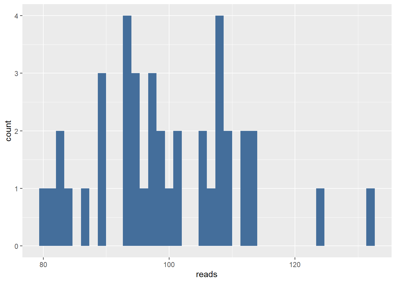
#calculate single datapoint for a single $\lambda$
dpois(reads[1], lambda = 95)
## [1] 0.01637099699
After taking a look at the plot we decide the \(\lambda\) must lie somewhere between 70 and 130. So we want to know what \(\lambda\) between 70 and 130 is most likely for the first data point.
dpois(reads[1], lambda = seq(from = 70, to = 130))
##  [1] 5.595979651e-06 9.525657995e-06 1.587115218e-05 2.589841897e-05
##  [5] 4.141289663e-05 6.492797256e-05 9.985938336e-05 1.507386947e-04
##  [9] 2.234338867e-04 3.253593766e-04 4.656521163e-04 6.552854772e-04
## [13] 9.070893743e-04 1.235644433e-03 1.657020773e-03 2.188338765e-03
## [17] 2.847140039e-03 3.650571807e-03 4.614405145e-03 5.751927012e-03
## [21] 7.072764315e-03 8.581714373e-03 1.027766734e-02 1.215271086e-02
## [25] 1.419150414e-02 1.637099699e-02 1.866055016e-02 2.102248709e-02
## [29] 2.341307663e-02 2.578391414e-02 2.808363681e-02 3.025988231e-02
## [33] 3.226137953e-02 3.404004851e-02 3.555298459e-02 3.676420998e-02
## [37] 3.764609251e-02 3.818035522e-02 3.835862978e-02 3.818253762e-02
## [41] 3.766331356e-02 3.682101499e-02 3.568338235e-02 3.428443363e-02
## [45] 3.266288528e-02 3.086049427e-02 2.892041189e-02 2.688563041e-02
## [49] 2.479758929e-02 2.269499138e-02 2.061286139e-02 1.858186164e-02
## [53] 1.662786382e-02 1.477176193e-02 1.302950089e-02 1.141228753e-02
## [57] 9.926946724e-03 8.576383641e-03 7.360114601e-03 6.274831745e-03
## [61] 5.314971498e-03

likelihood <- dpois(reads[1], lambda = seq(from = 70, to = 130))
likelihood <- data.frame(likelihood = likelihood)

ggplot(data = likelihood, aes(x = seq(from = 70, to = 130), y = likelihood)) +
  geom_point(colour = "#446e9b")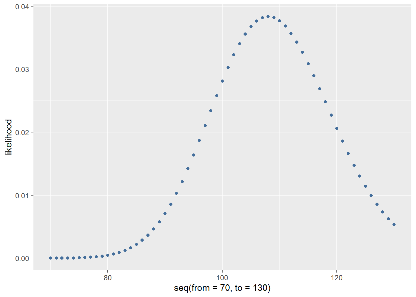
As you can see there are a lot of small numbers. Because these numbers sometimes need to be multiplied later on in the estimation process we use a log transform. This transform is done because multiplying very small numbers soon become smaller than the CPU of the computer can represent in its memory (arithmatic underflow). To do this we can simply add “log = TRUE” to the dpois function.
log_likelihood <- dpois(reads[1], lambda = seq(from = 70, to = 130), log = TRUE)
log_likelihood <- data.frame(log_likelihood = log_likelihood)

ggplot(data = log_likelihood, aes(x = seq(from = 70, to = 130), y = log_likelihood)) +
  geom_point(colour = "#446e9b") +
  xlab("lambda")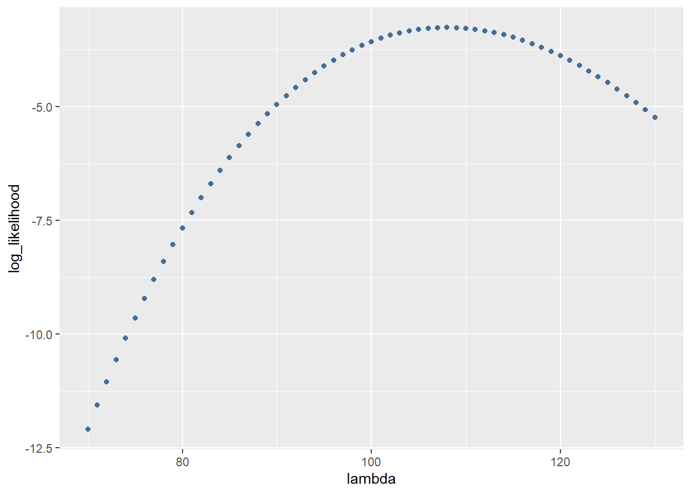
Until now we only took 1 datapoint and calculated the likelihood it was generated by a \(\lambda\) from 70 to 130. To estimate the \(\lambda\) of the complete dataset we are going to take the sum of probabilities at each datapoint. To do this we first write a function to calculate the sum of 1 datapoint:
MLE_function <- function(lambda, datapoint){
  probabilities <- sum(dpois(datapoint, lambda, log = TRUE))
  return(probabilities)
}
Next we can apply the function to all the datapoints:
all_data_log_likelihood <- (sapply(seq(from = 70, to = 130),function(x){MLE_function(x,reads)}))
all_data_log_likelihood <- data.frame(all_data_log_likelihood = all_data_log_likelihood, lambda = seq(from = 70, to = 130))
And plot the results with a red line showing the most likely estimate of \(\lambda\):
ggplot(data = all_data_log_likelihood, aes(x = lambda, y = all_data_log_likelihood)) +
  geom_point(colour = "#446e9b") +
  geom_vline(xintercept = all_data_log_likelihood$lambda[which.max(all_data_log_likelihood$all_data_log_likelihood)], color="red",size=2) +
  ylab("probability")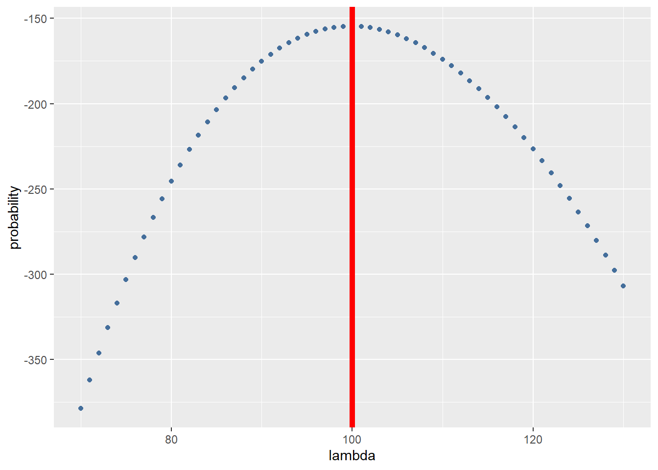
Depending on your seed the \(\lambda\) estimated can vary but it should approach 100.
@Marc: We hadden dit vorige week al besproken maar de MLE lambda is nogsteeds gelijk aan het gemiddelde van de reads. Misschien is Poisson gewoon een slecht voorbeeld om een MLE mee te doen. In principe is het bovenstaande stuk over MLE nu zo goed als gelijk aan de website die je mij doorstuurde: https://cmdlinetips.com/2019/03/introduction-to-maximum-likelihood-estimation-in-r/
3.6 Estimation of size factor
When comparing the read counts of a gene between 2 experimental conditions we need to make sure that the difference is only influenced by the treatment and not by any other variables. For example: If the read depth of 1 sample x is twice the size of sample y we are likely to find twice as many reads for each gene. This makes it hard to compare samples so we need to correct for this difference. We can first take al ook at the total reads per treatment:
#total reads per treatment.
sum(assay(airway[,airway$dex == "trt"]))
## [1] 85955244
sum(assay(airway[,airway$dex == "untrt"]))
## [1] 89561179
The difference is not huge. But its still 3.6 million reads less in the treated group. Could it be that the treated group has some genes downregulated? Or is something else going on? The difference becomes more apparent if we take a look at the individual samples in figure 8. The total amount of reads ranges from 15 million to over 30 million within the treated condition! This difference can be due to multiple reasons: Conditions in the well might have been slightly different leading to quicker cellgrowth or the samples might nog have an equal sequencing depth.
#create a dataframe with the total reads of all samples and their treatment.
reads_per_sample <- data.frame(reads = c(sum(assay(airway[,1])),
                                         sum(assay(airway[,2])),
                                         sum(assay(airway[,3])),
                                         sum(assay(airway[,4])),
                                         sum(assay(airway[,5])),
                                         sum(assay(airway[,6])),
                                         sum(assay(airway[,7])),
                                         sum(assay(airway[,8]))),
                               dextreatment = colData(airway)$dex
) ggplot(data = reads_per_sample, mapping = aes(x = 1:8, y = reads, fill = dextreatment)) +
geom_col()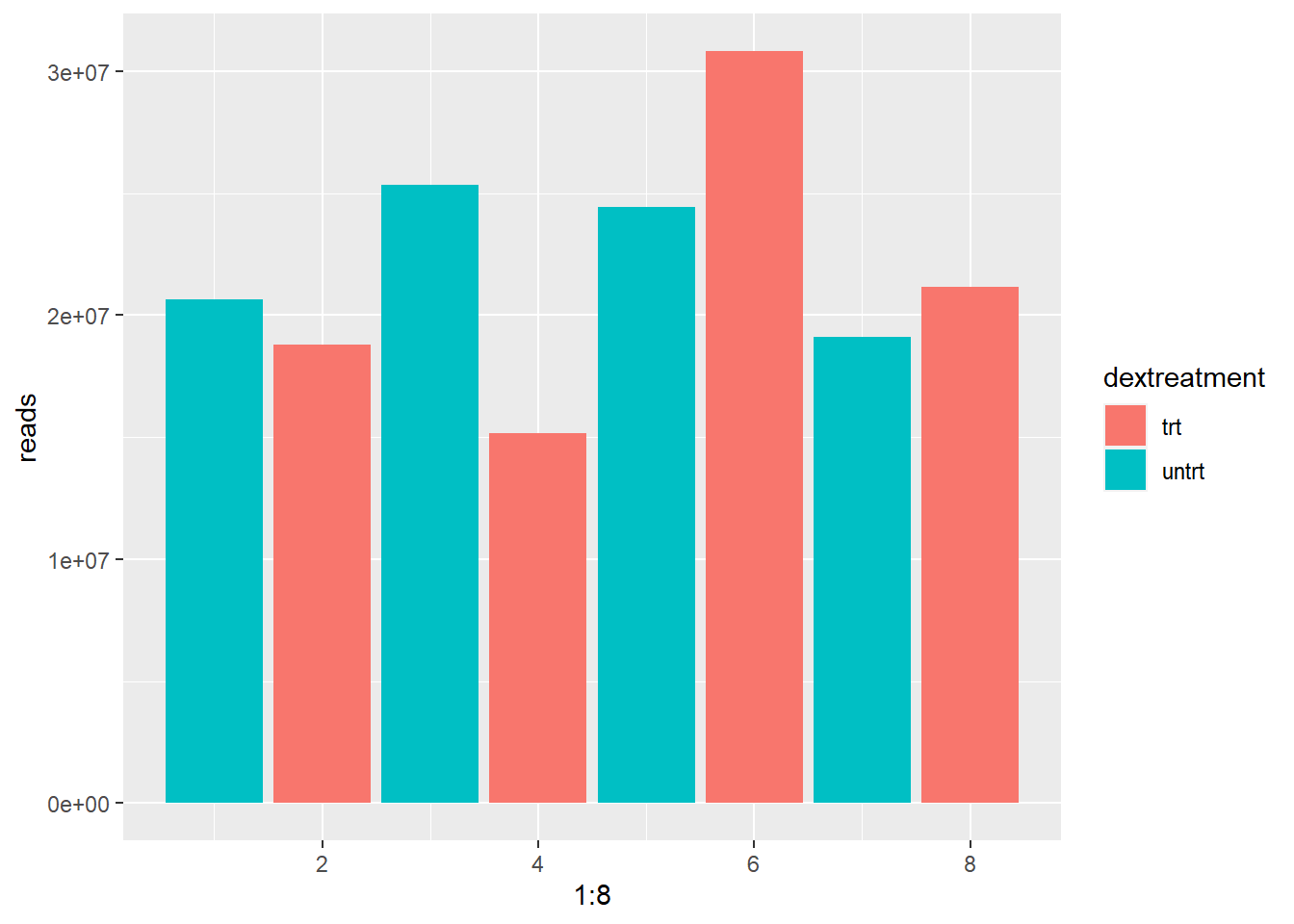
Figure 8: Read depth varies between samples.
In order to adjust for this effect we need to scale the reads so the total amount of reads will become (more) equal between samples. To do this we calculate a size factor. We could take the total reads of sample 2 and divide by the total reads of sample 1. 320/260 = 1.231. We could use this size factor to correct the reads of each genes so that the total number of reads in each sample will become equal. This method is flawed as we can see in figure 9. The blue line represents the size factor we just calculated. Using this size factor implies gene A,B,D and E are upregulated and gene C is downregulated. However this is not likely the case. It is more likely that A,B,D and E are present in equal amounts in both samples and gene C is downregulated in sample 2. The higher countnumber of A,B,D and E is a result of the difference in read depth. If we plot a regression line through these points (red line) we get a more exact size factor that estimates only the difference in read depth and not the difference in expression of genes (If lots of genes are upregulated it is expected to find more mRNA’s in a cell overall). In this hypothetical dataset the sizefactor calculated by the red line is 1.5. This last method is what DESeq2 uses to estimate the size factor.
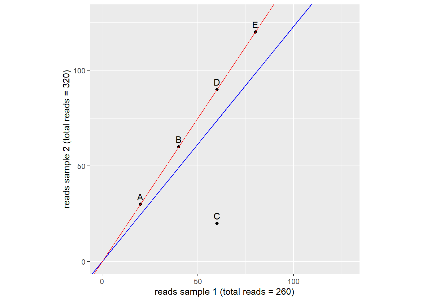
Figure 9: estimation of size factor. Dots represent genes. Blue and red lines represent two ways of size factor esimation. source: Modern Statistics for Modern Biology
As we discussed earlier DESeq2 is a wrapper function. The functions within it can often be called separately like the size-factor-estimation function.
#estimate the sizefactors and return them
estim <- DESeq2::estimateSizeFactorsForMatrix(assay(airway))

#mutate the size factor into the dataframe
reads_per_sample <- mutate(reads_per_sample,
                           sizefactor = estim)

#calculate the adjusted reads using the sizefactor.
reads_per_sample <- mutate(reads_per_sample,
                           reads_adjust = reads_per_sample$reads/reads_per_sample$sizefactor)
Now we have adjusted the reads for the size factor we can plot the total reads again and see if the samples have become more equal:
ggplot(data = reads_per_sample, mapping = aes(x = 1:8, y = reads_adjust, fill = dextreatment)) +
  geom_col()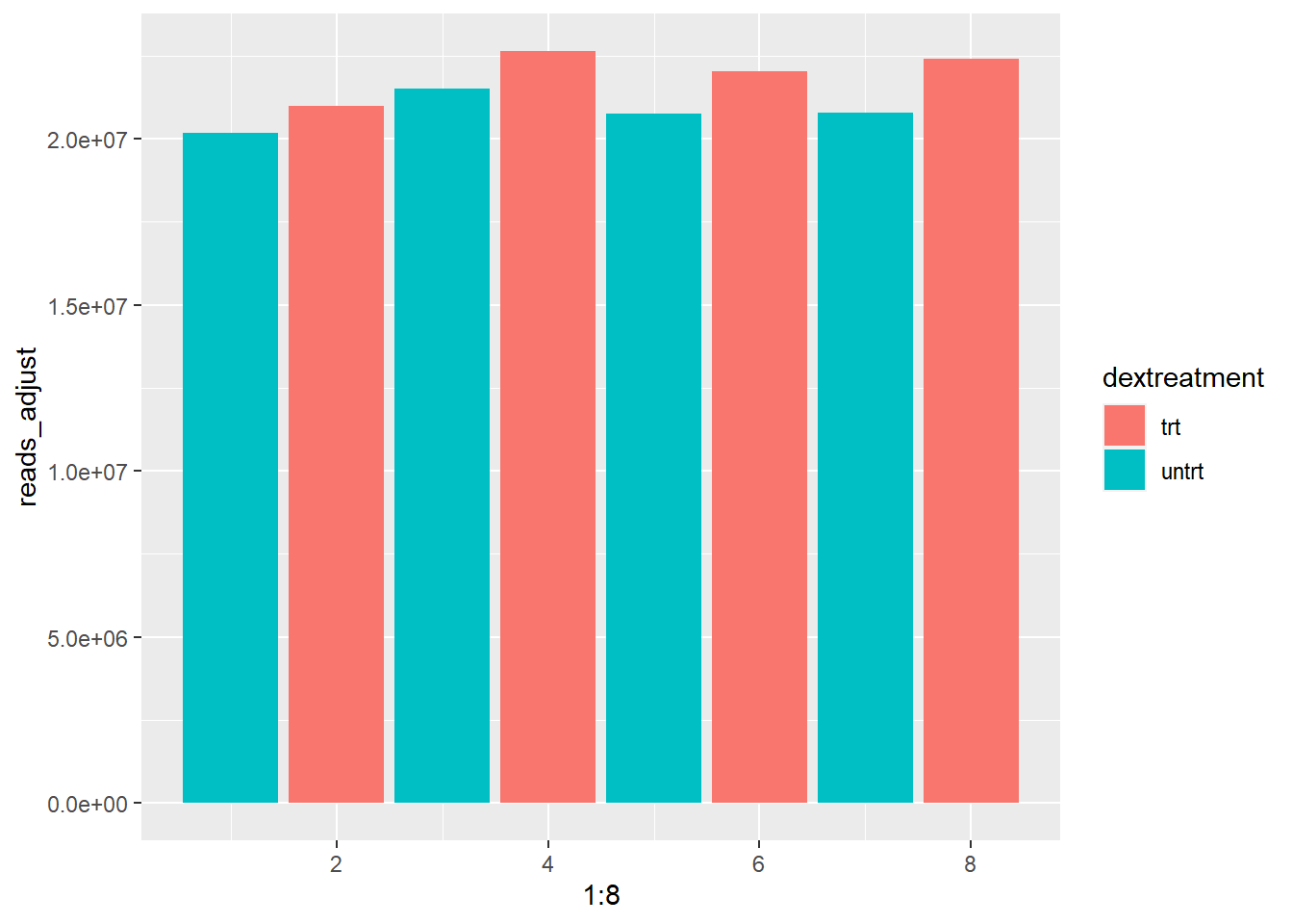
As you can see the range of total reads has drastically decreased. All samples now have between 20 and about 22,5 million total reads.
Note: if you look at the help page of estimateSizeFactorsForMatrix you might notice the function also accepts an optional argument called controlGenes. The control genes can come in 2 forms:
- Spike-in genes: These are artificial mRNA sequences that can be added in a known quantity to the sample.
- Housekeeping genes: These genes are essential for basic maintenance and function of the cell. Some of these are expressed at relatively constant rates.
3.7 Estimating dispersion and negative binomial distribution
At first it was believed that the expression of a gene followed a Poisson distribution. It turned out however that this was only the case when evaluating samples that were technical replicates.
The main problem with the Poisson distribution is the \(\lambda\) parameter because in this distribtion: \(\lambda\) = mean = variance. To accurately model the data we need a distribution that uses separate parameters for mean and variance (dispersion). This is where the negative binomial distribution comes in. It accepts these parameters and is used by DEseq to model the data. Before we can use this distribution however we do need to find out what these 2 parameters are. The mean is simple enough but what about the dispersion parameter?
Estimating dispersion of a gene is hard/impossible if you only have 3 samples per experiment group because n is too small. You would need quite alot of samples to accurately predict the dispersion and quite often you are working with data gathered by someone else so this is simply not an option. As a solution DESeq2 assumes genes of similar average expression have a similar dispersion (Love et al 2014). DEseq2 calculates the dispersion of individual genes and then calculates an average dispersion of genes that are expressed in simular quantities. It then “shrinks” the individual dispersions towards the average dispersion. To get a better understanding of this shrinking it is useful to plot the dispersion in your dataset (figure 10).
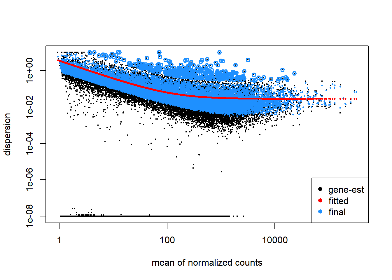
Figure 10: Plot of dispersion estimates of airway dataset. The black dots represent the dispersion calculated for a given gene (gene-wise estimate). the average dispersion of genes with simular expression (mean of counts) is calculated. A red line is fitted trough the average dispersions and the genes are shrunken toward the red line resulting in the blue dots. The blue dot represent the final estimated dispersion of a gene. The thicker blue dots in the uppermost part of the graph are considered outliers and for this reason they are not shrunk towards the fitted value.
To get the calculated dispersion we can use the dispersions() function:
dispersiondataframe <- data.frame(assay(ddsDE_airway)) %>%
  mutate(disp = dispersions(ddsDE_airway))

head(dispersiondataframe)
##   SRR1039508 SRR1039509 SRR1039512 SRR1039513 SRR1039516 SRR1039517 SRR1039520
## 1        679        448        873        408       1138       1047        770
## 2        467        515        621        365        587        799        417
## 3        260        211        263        164        245        331        233
## 4         60         55         40         35         78         63         76
## 5       3251       3679       6177       4252       6721      11027       5176
## 6       1433       1062       1733        881       1424       1439       1359
##   SRR1039521           disp
## 1        572 0.027339410959
## 2        508 0.007813516794
## 3        229 0.011124686099
## 4         60 0.069839646073
## 5       7995 0.064169948967
## 6       1109 0.012967940843
Once the mean and dispersion of each gene have been estimated DESeq2 tests for significant differential expression between genes before and after treatment. Once the analysis is complete we can get the results using the res() function. Next we arrange genes so that the genes with the smallest p adjusted come first and show the head of the results:
res <- results(ddsDE_airway)
res[order(res$padj), ] %>% head
## log2 fold change (MLE): dex untrt vs trt
## Wald test p-value: dex untrt vs trt
## DataFrame with 6 rows and 6 columns
##                  baseMean log2FoldChange     lfcSE      stat       pvalue
##                 <numeric>      <numeric> <numeric> <numeric>    <numeric>
## ENSG00000152583   997.445       -4.60255 0.2117419  -21.7366 9.24620e-105
## ENSG00000148175 11193.723       -1.45149 0.0848958  -17.0974  1.55289e-65
## ENSG00000179094   776.600       -3.18388 0.2015094  -15.8002  3.10293e-56
## ENSG00000134686  2737.982       -1.38717 0.0916587  -15.1341  9.65548e-52
## ENSG00000125148  3656.267       -2.20347 0.1474191  -14.9470  1.63019e-50
## ENSG00000120129  3409.038       -2.94901 0.2015464  -14.6319  1.75745e-48
##                         padj
##                    <numeric>
## ENSG00000152583 1.70269e-100
## ENSG00000148175  1.42982e-61
## ENSG00000179094  1.90468e-52
## ENSG00000134686  4.44514e-48
## ENSG00000125148  6.00399e-47
## ENSG00000120129  5.39389e-45
Annotating the results to show a gene-name instead of a ensembl ID will be covered in another lesson.
4 Exploring results
4.1 Histogram of p-values
The first plot is a histogram of p-values (figure 11). The left peak is the number of genes with a p < 0.01. This plot gives us the possibility to make a rough estimation of the False Discovery Rate (FDR). Because we are looking at so many genes there are bound to be some genes that just happen to be differentially expressed. Looking at the area to the right of p > 0.05 we get an idea of the scale of this “background”.
For example: If we look at the background we see that about 175-200 genes happen to have a p-value of 0.75. The same goes for most p-values > 0.10. So it is likely that about 175-200 genes in the left peak just happen to be differentially expressed regardless of the experimental condition. About 2900 genes in total have a p < 0.01. 200/2900 = 0.068. So about 7% of our differentially expressed genes are false positives (type I error).
res <- results(ddsDE_airway)

ggplot(as(res, "data.frame"), aes(x = pvalue)) +
  geom_histogram(binwidth = 0.01,  fill = "#446e9b", boundary = 0)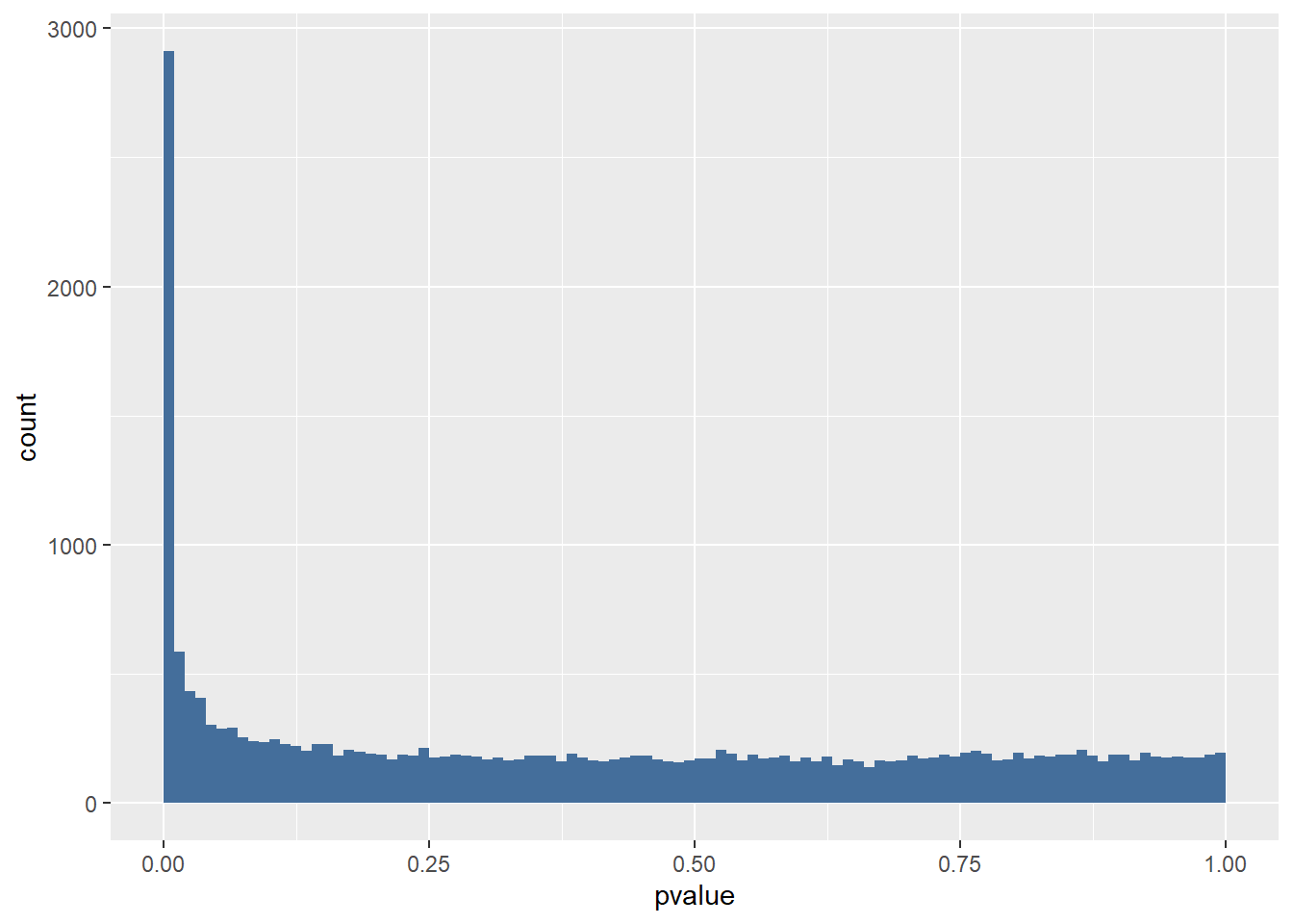
Figure 101 Histogram of P values for the airway dataset results.
4.2 Log2 fold change and shrinkage
After running DESeq2 and taking a look at the results you might notice a column for the log2FoldChange and one for the lfcSE. Log2FoldChange is a parameter that is calculated to show the relative difference in expression. Regular expression amounts of genes varies wildly from a couple of counts up to 400.000 in the airway dataset. This makes hard to visualize the increase or decrease of expression. So lets make a hypothetical dataset and to experiment on:
df <- data.frame(genes = c("gene1", "gene2", "gene3", "gene4"),
                 sample1 = c(1000,23,230000,7523),
                 sample2 = c(8000,85,200000,3250))
df
##   genes sample1 sample2
## 1 gene1    1000    8000
## 2 gene2      23      85
## 3 gene3  230000  200000
## 4 gene4    7523    3250
Now in order to quickly view how much each gene has changed we calculate the “fold change”. For example: If sample 1 is the “before treatment” and sample 2 is “after treatment”. We simply take the expression of sample 2 and divide it by the expression of sample 1. If the result is >1 the gene is upregulated after treatment.
df <- mutate(df,
             foldchange = df$sample2 / df$sample1)

df
##   genes sample1 sample2   foldchange
## 1 gene1    1000    8000 8.0000000000
## 2 gene2      23      85 3.6956521739
## 3 gene3  230000  200000 0.8695652174
## 4 gene4    7523    3250 0.4320085072

ggplot(df, aes(x = genes, y = foldchange)) +
  geom_point()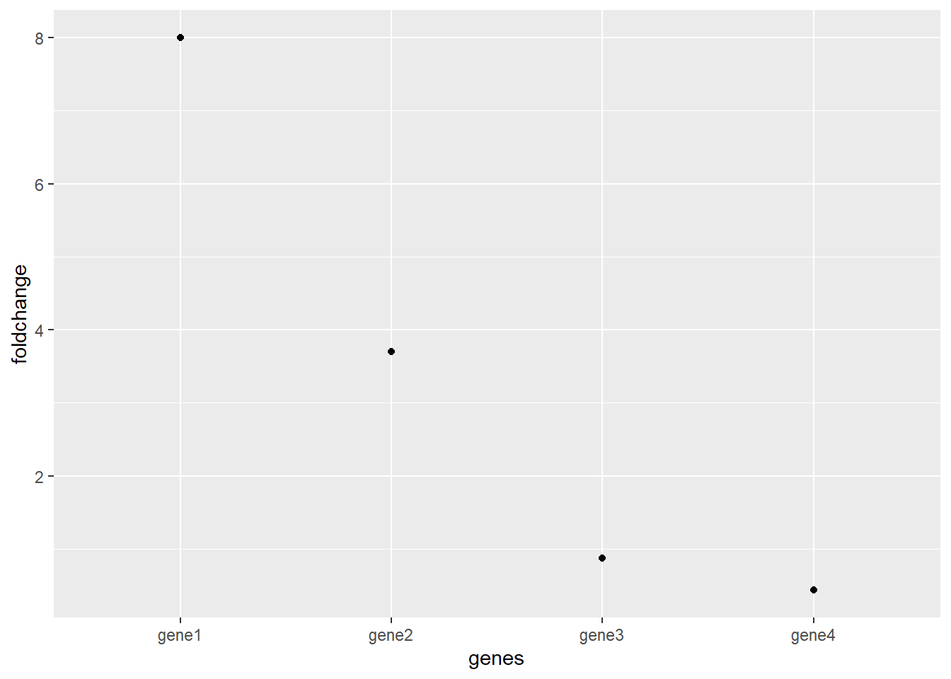
Now this graph shows the fold change for all the upregulated genes are >1 and all the downregulated genes are between 0 an 1. These downregulated genes are a problem now because its still hard to compare upregulation and downregulation.
The solution is taking the log2 of the fold change:
df <- mutate(df,
log2foldchange = log2(df$foldchange))
df
## genes sample1 sample2 foldchange log2foldchange
## 1 gene1 1000 8000 8.0000000000 3.0000000000
## 2 gene2 23 85 3.6956521739 1.8858289801
## 3 gene3 230000 200000 0.8695652174 -0.2016338612
## 4 gene4 7523 3250 0.4320085072 -1.2108683722
ggplot(df, aes(x = genes, y = log2foldchange)) +
geom_point()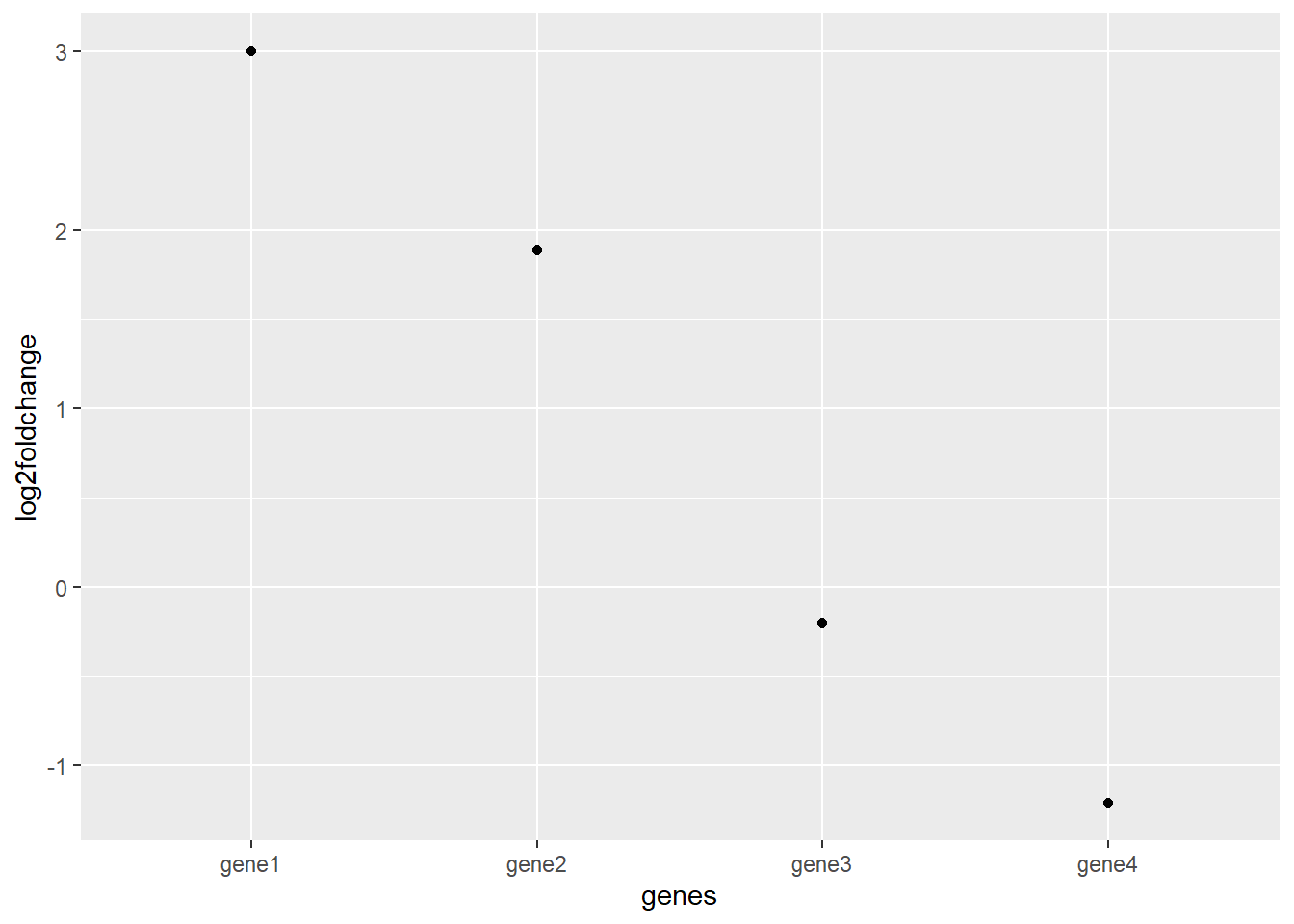 notice that due to the logarithmic scaling a gene with a fold change of 8 has a log2fold change of 3 because 2x2x2 = 8.
The result is a much clearer graph of relative differences in gene expression.
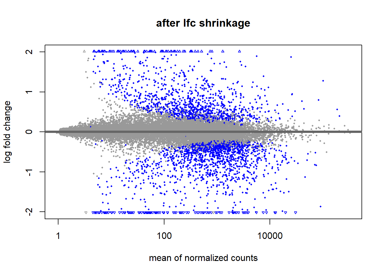
The other parameter in the DESeq2 results is the lfcSE. This is short for Log2FoldChange Shrinkage Estimate. Shrinking the data is done because genes with low counts have less “statistical information”. The effect of this shrinkage is usually visualized using a MA plot. Shrinkage is estimated using a Empirical Bayes method. Bayesian statistics fall outside of the scope for this lesson but learning about it is time well-spent.
data(airway)
ddsSE_airway <- DESeq2::DESeqDataSet(airway, design =  ~dex)
keep <- rowSums(counts(ddsSE_airway)) >= 10
ddsSE_airway <- ddsSE_airway[keep,]
ddsDE_airway <- DESeq(ddsSE_airway)
res <- results(ddsDE_airway)

resultsNames(ddsDE_airway)
## [1] "Intercept"        "dex_untrt_vs_trt"
resLFC_airway <- lfcShrink(ddsDE_airway, coef="dex_untrt_vs_trt", type="apeglm")

DESeq2::plotMA(res, main = "before lfc shrinkage", alpha = 0.05)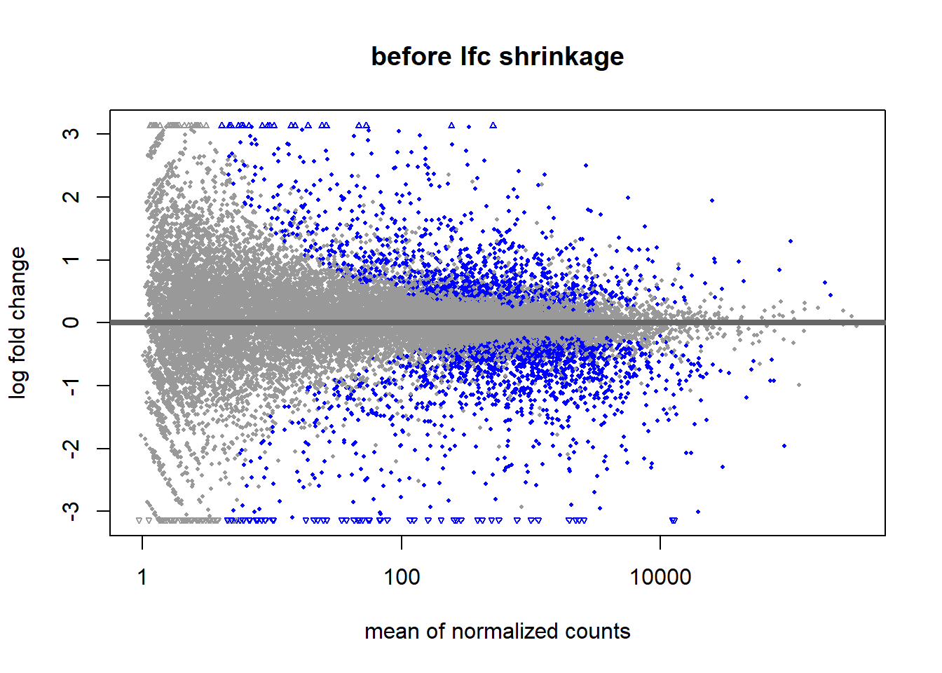
4.3 Principal Component Analysis
Data can contain a lot of variables. Some might even be unknown to us. To get an idea of the variance in our data and what variables (principal components) are mainly responsible for this variance we can do a Principal Component Analysis (PCA). A principal component analysis tries to compress a big amount of data into a single point on a plot to show relations or clusters and what principal components cause these clusters.
#principal component analysis
ddsDE_rlog_airway <- ddsDE_airway %>%
  rlogTransformation()


ddsDE_rlog_airway %>%
  DESeq2::plotPCA(intgroup = c("dex", "cell")) +
  geom_vline(xintercept = 0, linetype = "dashed", colour = "red") +
  geom_hline(yintercept = 0, linetype = "dashed", colour = "red")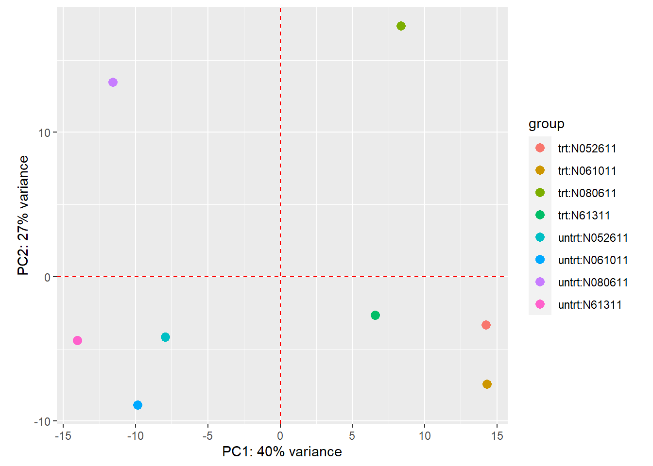
Figure 12: PCA plot of airway dataset. The clusters show principal component 1 is the treatment variable explaining 40% of the variance in the data. Principal component 2 is the celllines explaining 27% of the variance. It looks like cellline N080611 is the odd one out and the other cellines are fairly simular.
PCA compresses the data by reducing the dimensions in the data. A simple example of dimension reduction can be seen in figure 13 and 14. By rotating the line fitted through the data it can be compressed from 2 dimensions to 1 dimension while maintaining the component that cause the most variance in the 2 dimensions.
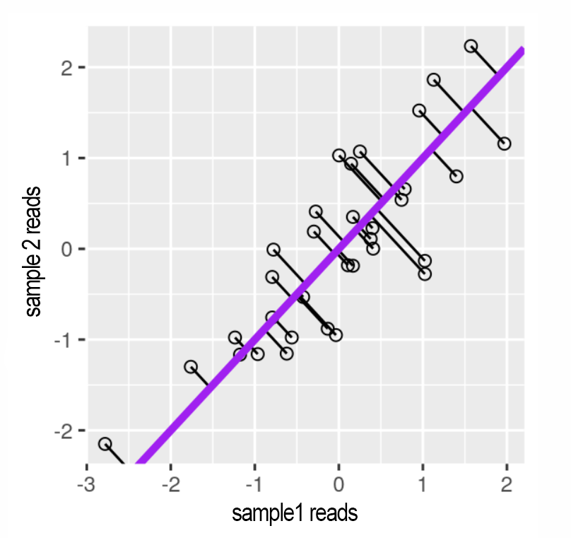
Figure 13: Reads for 2 correlating samples. A principal component line is fitted through it and the datapoints are projected onto the line. Source: Modern Statistics for Modern Biology
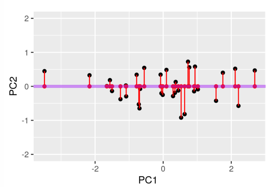
Figure 14: The line is rotated so the red dots represent the 2 dimensional data (x and y) in 1 dimension (x). Source: Modern Statistics for Modern Biology
The one dimensional data can be described with an “eigenvalue”. This value represents the variance introduced by a variable. The eigenvalues of a dataset can be plotted in a scree plot.
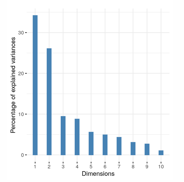
Figure 15:A scree plot showing the eigenvalues of each dimension. Dimension 1 and 2 (PC1 and PC2) are responsible for most variance in the data so a 2 dimensional PCA plot can accurately portray the data. Source: Modern Statistics for Modern Biology
If the eigenvalue of PC3 is about equal to the eigenvalue of PC2 it is not possible to accurately plot the data in 2 dimensions and a 3d PCA plot should be used.
4.4 Transcript length bias
A much overlooked bias is the transcript length bias. This bias is the result of longer mRNA molecules being broken up into more fragments compared to shorter mRNA’s. This results in overrepresentation of longer genes within samples. It is possible to correct for this within sample variation but doing so introduces variation between samples. Since we are usually interested in the differential expression of genes between samples we choose to leave the transcript length bias as is.
However it is important to be aware of its presence.
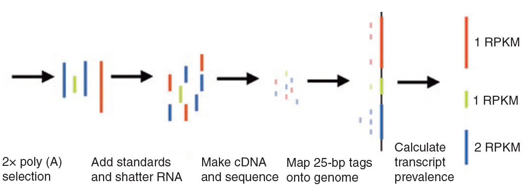
Figure 16:Transcript length bias. Both red and green mRNA’s are present in equal amounts in the sample. After producing the cDNA library and mapping the reads to the genome the longer red gene becomes overrepresented. To correct for this overrepresentation a genes expression can be calculated as Reads Per Kilobase Million (RPKM). source: Mortazavi 2008
To get an idea of the scale of this bias in our dataset we can plot the genelength in basepairs versus the % differentially expressed.
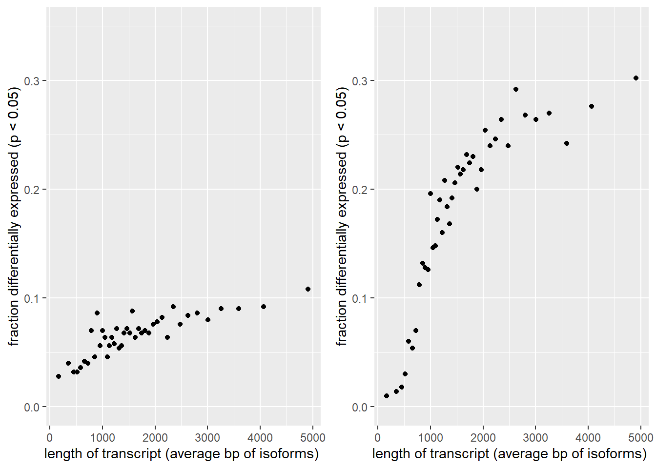
Figure 17) Left: Transcript length bias. Average bp length of all possible isoforms was calculated per gene. Genes were arranged by length and binned per 500 genes and the average genelength of each bin was calculated. The Y axis show the fraction of genes per bin that were differentially expressed. The DESeq2 results turn out to be slightly skewed towards the longer genes. Right: After performing a log fold shrink the bias becomes magnified.
5 Bibliography
Love, M.I., Huber, W., Anders, S. Moderated estimation of fold change and dispersion for RNA-seq data with DESeq2 Genome Biology 15(12):550 (2014)↩︎
Schurch, N. J., Schofield, P., Gierliński, M., Cole, C., Sherstnev, A., Singh, V., Wrobel, N., Gharbi, K., Simpson, G. G., Owen-Hughes, T., Blaxter, M., & Barton, G. J. (2016). How many biological replicates are needed in an RNA-seq experiment and which differential expression tool should you use?. RNA (New York, N.Y.), 22(6), 839–851. https://doi.org/10.1261/rna.053959.115↩︎
Conesa, A., Madrigal, P., Tarazona, S. et al. A survey of best practices for RNA-seq data analysis. Genome Biol 17, 13 (2016). https://doi.org/10.1186/s13059-016-0881-8↩︎
Tarazona, S., García-Alcalde, F., Dopazo, J., Ferrer, A., & Conesa, A. (2011). Differential expression in RNA-seq: a matter of depth. Genome research, 21(12), 2213–2223. https://doi.org/10.1101/gr.124321.111↩︎
Stark, R., Grzelak, M., & Hadfield, J. (2019). RNA sequencing: the teenage years. Nature reviews. Genetics, 20(11), 631–656. https://doi.org/10.1038/s41576-019-0150-2↩︎
Mortazavi, A., Williams, B., McCue, K. et al. Mapping and quantifying mammalian transcriptomes by RNA-Seq. Nat Methods 5, 621–628 (2008). https://doi.org/10.1038/nmeth.1226↩︎
Holmes, S., & Huber, W. (2019). Modern Statistics for Modern Biology (1st ed.) [E-book]. Cambridge University Press. https://www.huber.embl.de/msmb/↩︎
Clarke, R. (1946). An application of the Poisson distribution. Journal of the Institute of Actuaries, 72(3), 481-481. doi:10.1017/S0020268100035435↩︎